The Albert Baker Fund
Brand Redesign & Extension
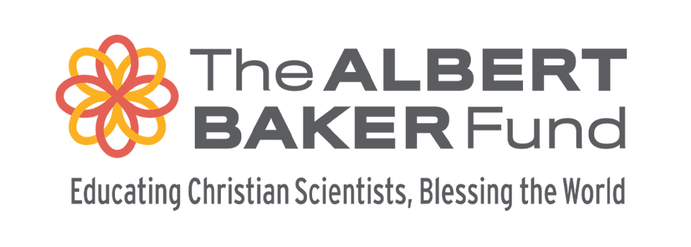
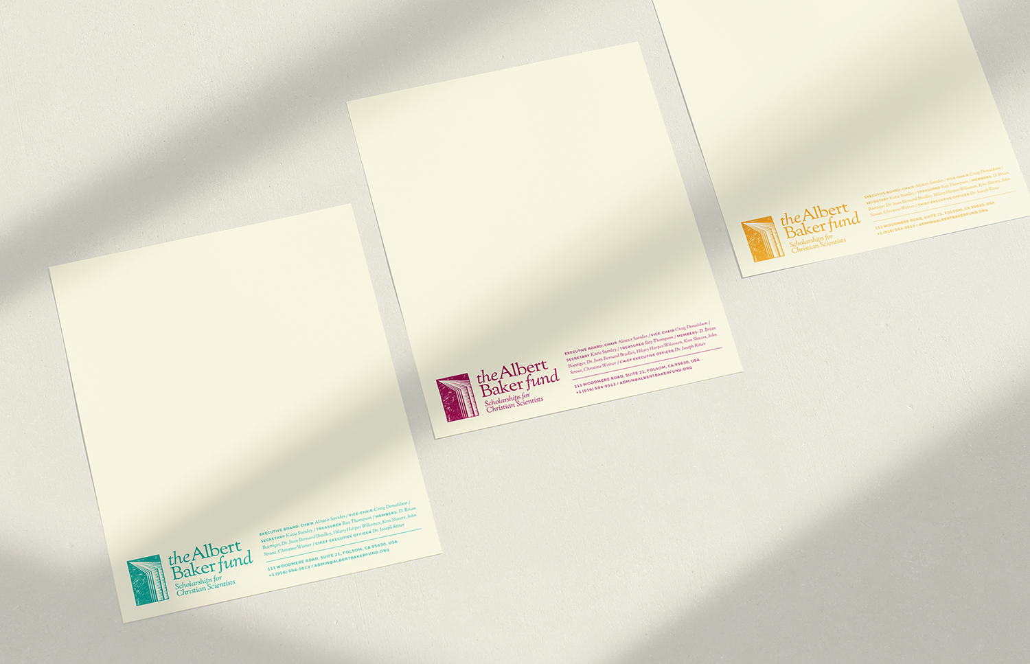
My goal was to update the logo and brand for The Albert Baker Fund to better communicate and connect with their audience. There was ample opportunity to give the logo and symbol more meaning and to develop a richer, more nuanced brand that was simple for staff to implement.
Starting with visual research of organizations and other logos in similar non-profit spaces, I was able to see where the opportunities were for Albert Baker to stand out. Additionally, I synthesized workshop documents and input from ABF to develop a brand essence that helped guide all my design work.
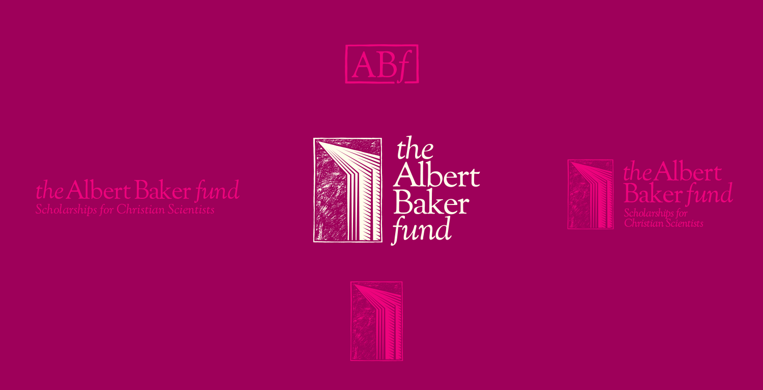
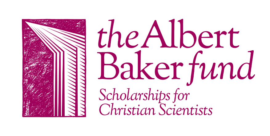
The final symbol and logo pull on cues from book and publisher logo design to allude to education and opportunity. ABF’s secondary “signature” logo also needed a refresh so I retooled the typography to ensure legibility when used on it’s own.
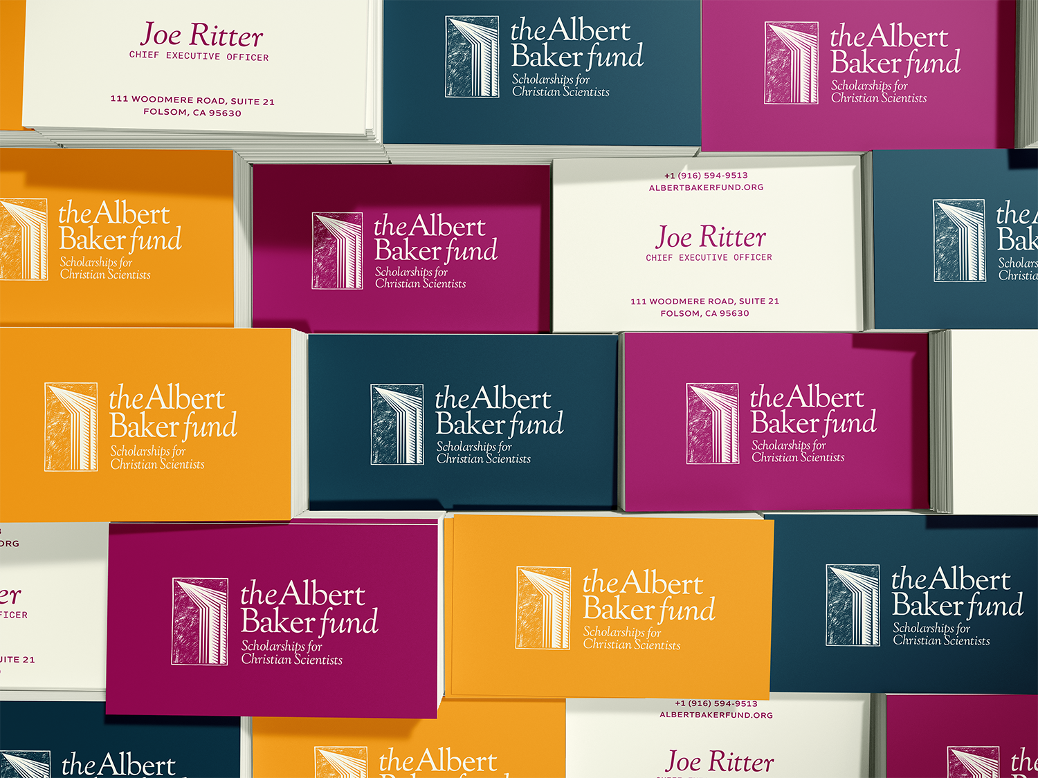
A family of colors, gradients, fonts, and icons keep the entire presentation warm and engaging while giving the brand flexibility across a broad range of applications.